

Phoenix Moon Counseling and Wellness


Overview
Our Client:
Dellissa Simmons, a Houston-based Licensed Professional Counselor
Tools
Figma & Figjam: Design, presentation, and collaboration
Google Forms: survey
Adobe XD - prototype
Zoom: Client meetings & Usability Testing
Webflow: Website Development
Problem:
Dellissa is starting her own therapy practice, but does not have a clear, easy-to-use website that helps potential clients find her, understand her services, book appointments, and contact her.
Business Goal:
Create a professional website that helps Dellissa attract new clients and make it easy for them to contact her or book a session.
Role
UI/UX Designer
Team
2 UX Designers
Timeline
December 2024 - June 2025

Identify
Identified user needs and pain points
Highlighted key services to build trust
Card sorting to prioritize the features
The Solution

Design
Flowcharts
Sitemap
Wireframes and Hi-Fi Design
Design System and mockups with consistent colors, typography, UI components,
Interactive prototype and branding

Mobile Optimization
Seamless experience on all devices
Readable content
Intuitive navigation
Clear call-to-actions.
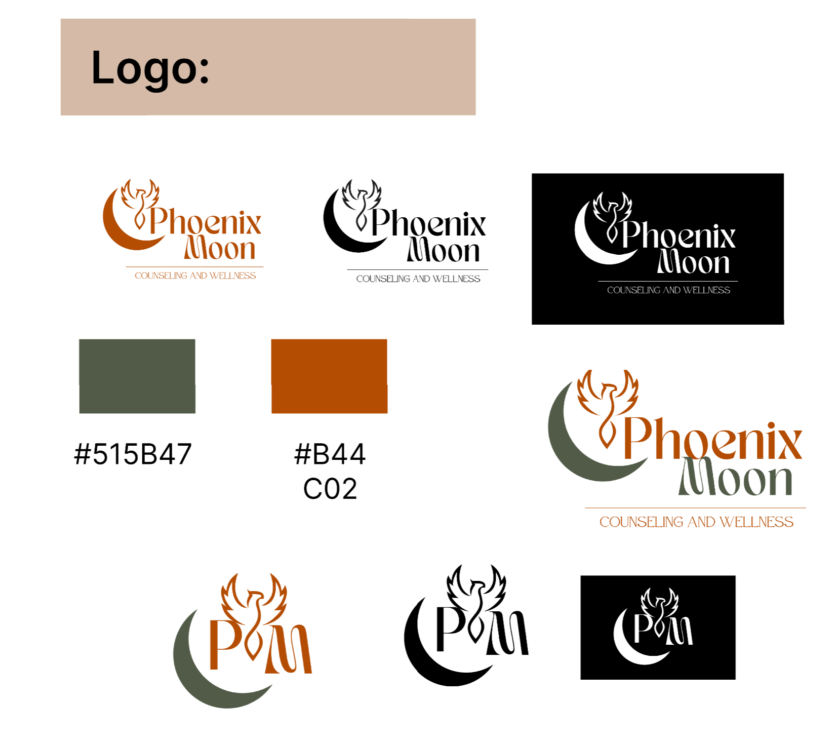
Branding
Defined logo
Brand identity and visual hierarchy
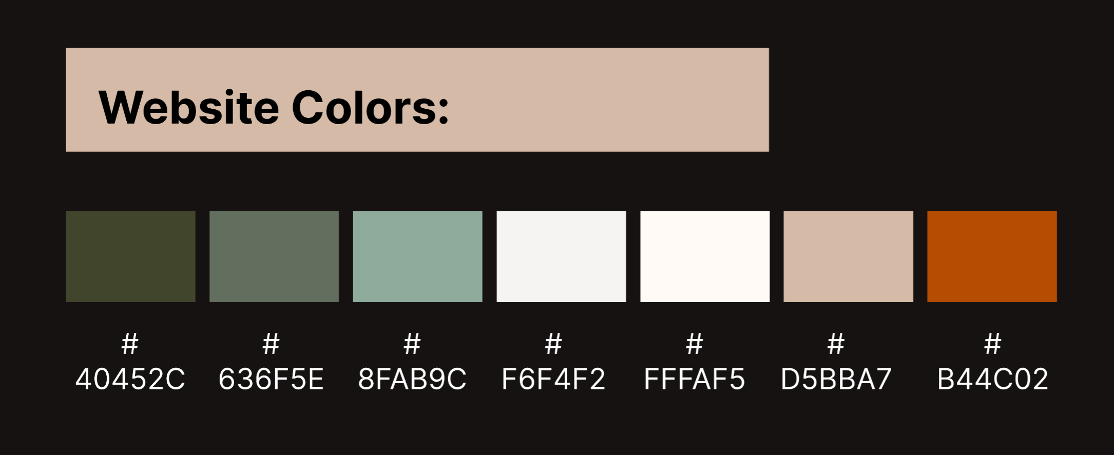
Brand assets: color palette, typography, images, & UI components
Calming and professional look
Discover
Time & Budget
Limited budget and resources required a cost-conscious approach
Design process prioritized efficiency and clarity
Focus on delivering a high-quality, polished experience despite constraints
So, How Did I Get Here
Project Strategy & Challenges
After understanding Dellissa’s goal of launching her private practice, the strategy focused on creating a website that balances business growth with a calm, user-friendly experience for clients seeking therapy. The project required clear planning to ensure the design supported both usability and brand credibility.
User Sensitivity
Users may be anxious or vulnerable
Content needed to feel clear and supportive
Navigation designed to be simple and non-overwhelming

Brand & Trust Building
Client was starting from scratch
Website needed to establish credibility immediately
Design had to convey personality and professional identity from the first visit
Mobile & Accessibility
Many users access the site on mobile devices
Design needed to be fully responsive
Content prioritized readability and ease of use across all screen sizes
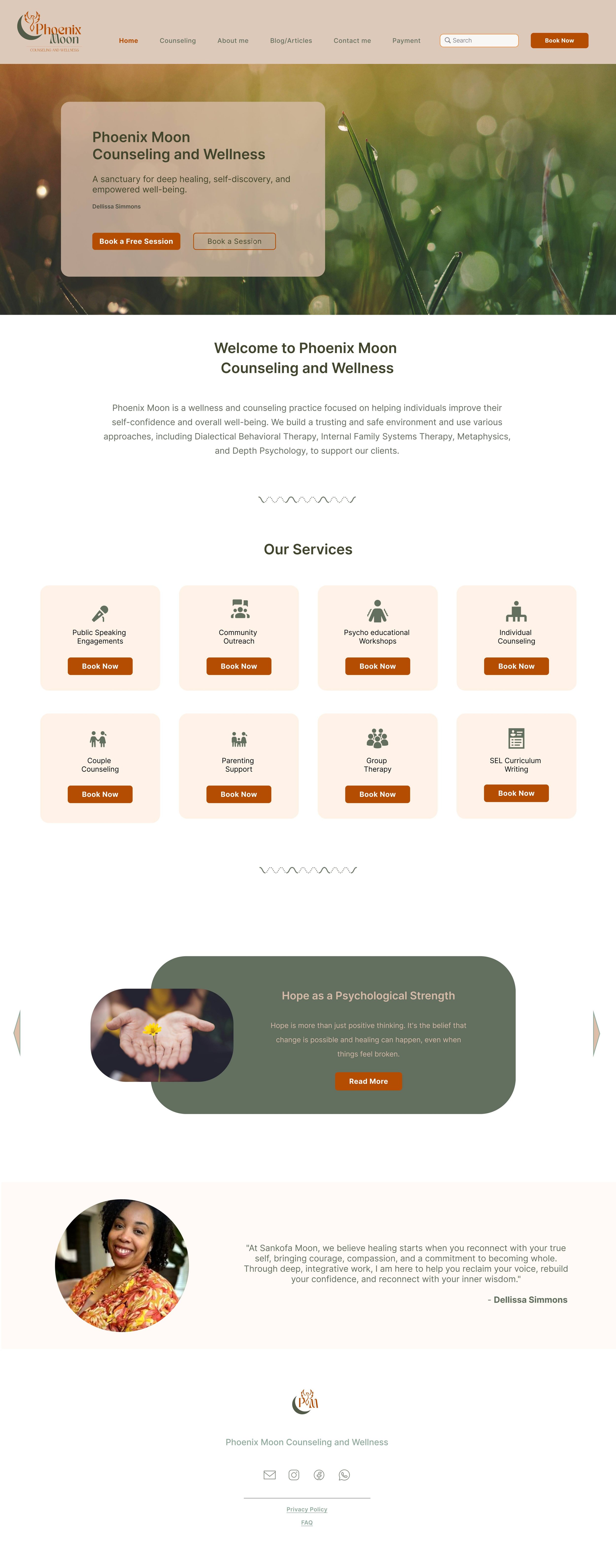
My Process: Double Diamond
As the UX designer for Dellissa’s therapy website, I used the Double Diamond framework to research user needs, define the core problem, develop wireframes and high-fidelity designs, and deliver a clear, mobile-friendly solution that helps clients understand her services and book sessions easily.
User Research
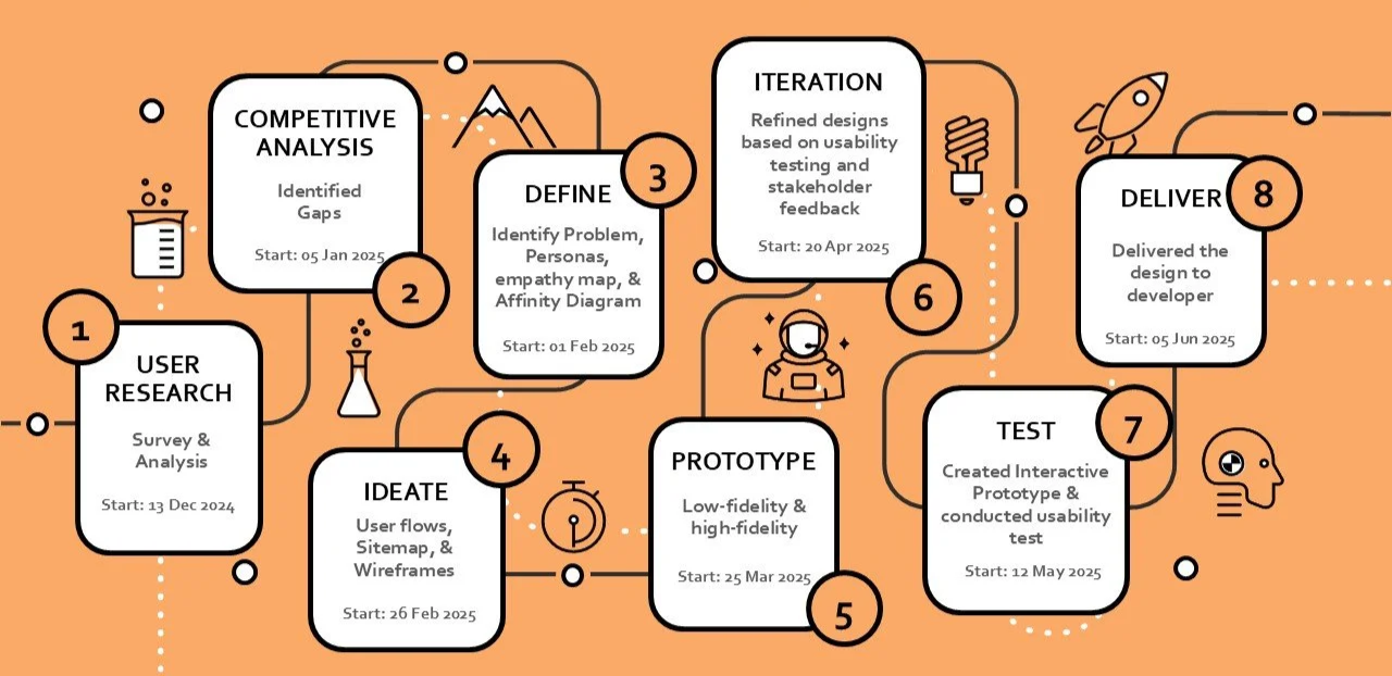
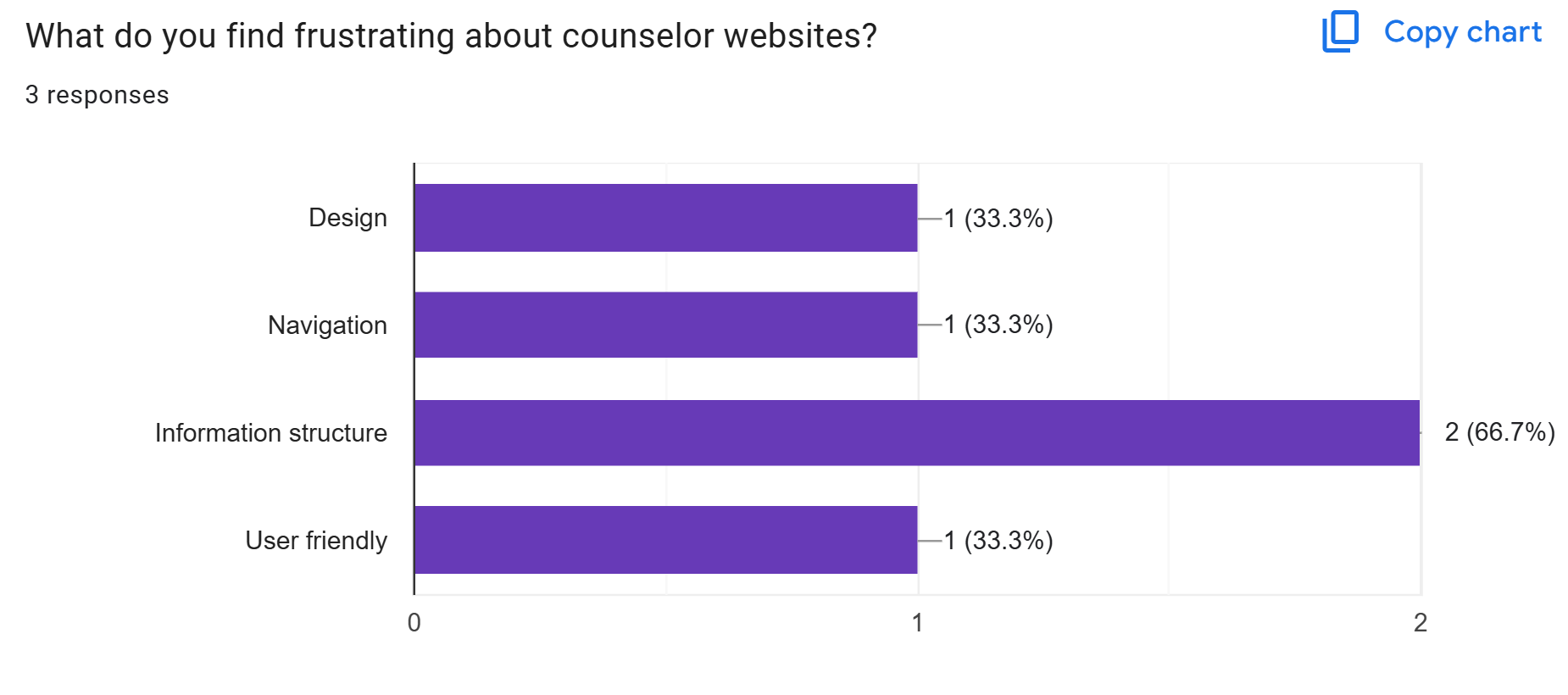
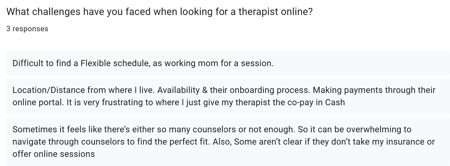
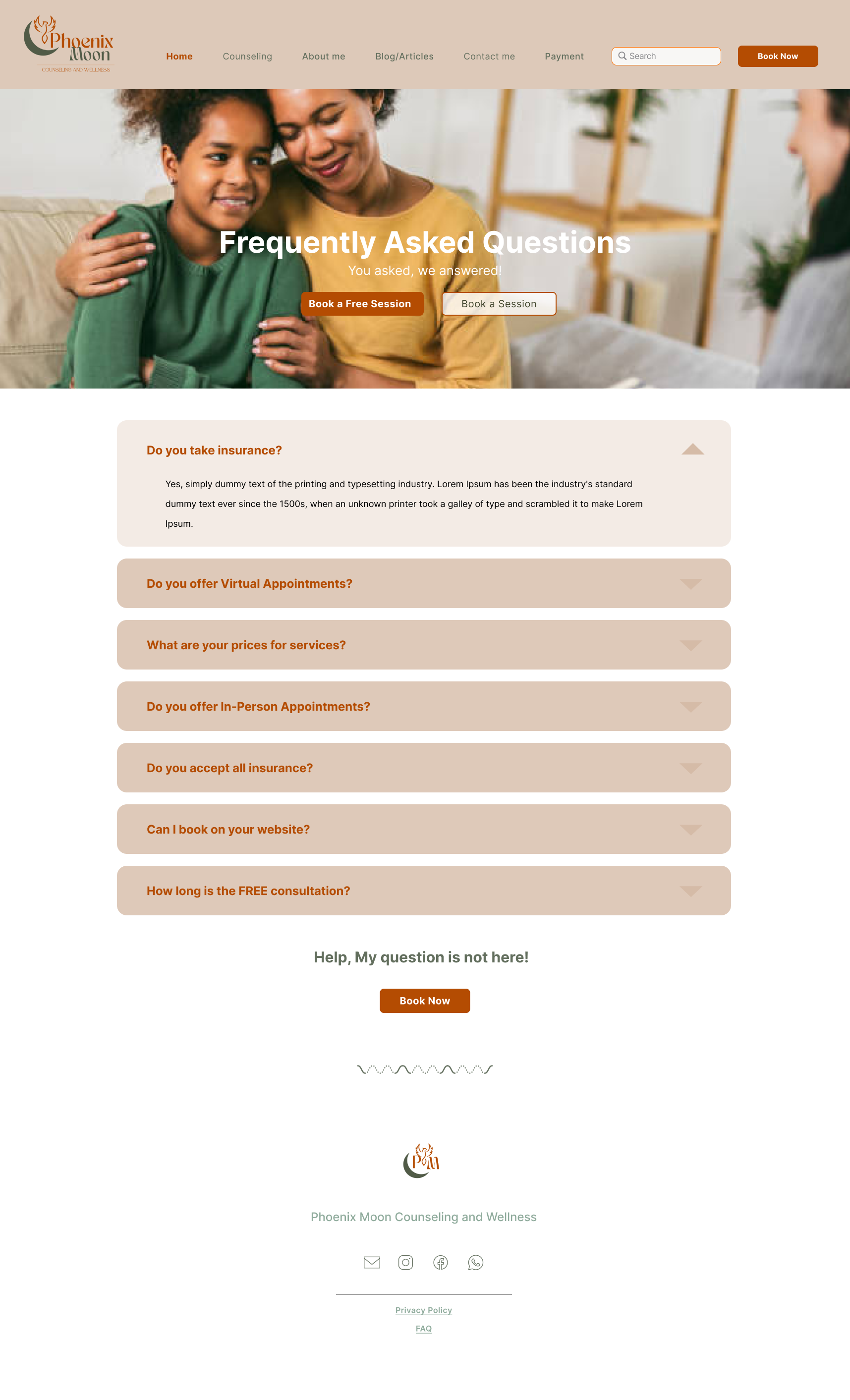
Survey: Conducted a short online survey targeting potential therapy clients.
Insights:
Booking & flexibility
Location and contact details
Overwhelmed with unclear details
Testimonials, services, qualifications, and pricing details
Lack of user-friendly design
Combitative Analysis

The booking process is not immediately visible
Calls-to-action not prominent
limited SEO depth
Long, dense text format
No clear call-to-action
Difficult to navigate
The website relies heavily on text, and no price details
Minimal engagement tools to guide hesitant users
Booking information can be hard to find

Similar Patterns and Gaps Across Competitor Websites
Lack of interactive engagement
Clear navigation and pricing details
Content-rich but uneven SEO strategy
Mobile optimization needs improvement
Trust-building through personalization
Help for decision making

Define
After research, I identified the core problem: users needed a calm, clear, and trustworthy website to understand Dellissa’s services and book sessions easily. The business goal was to attract clients and establish her online presence, guiding design decisions for clarity, accessibility, and conversion.
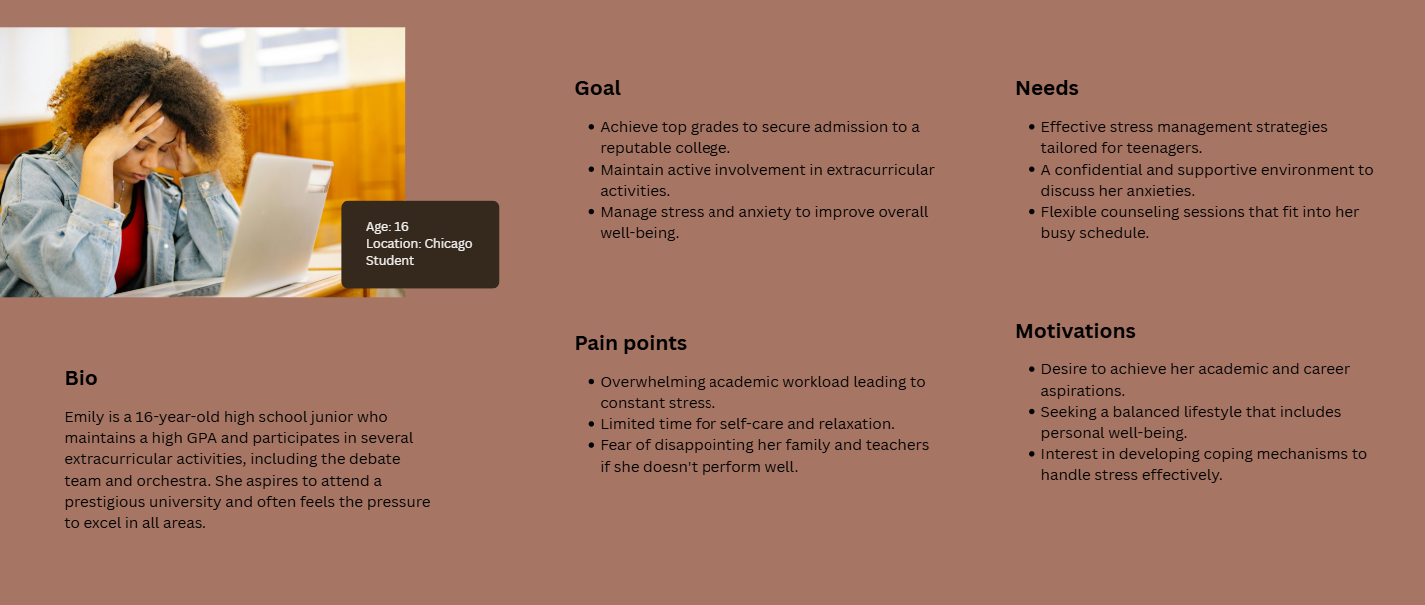
Personas & Empathy Maps


Design
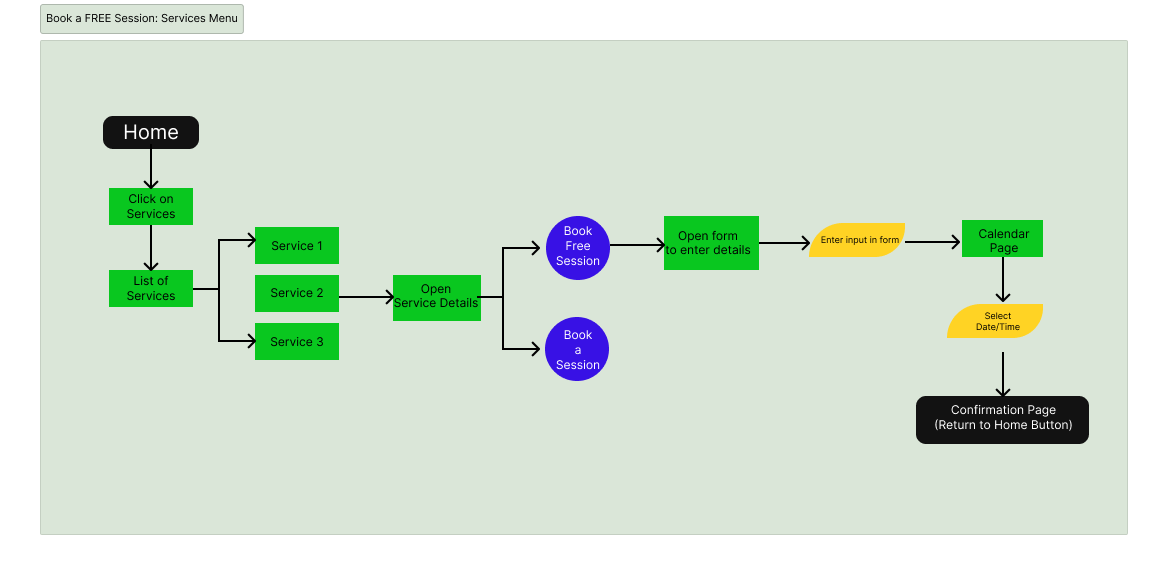
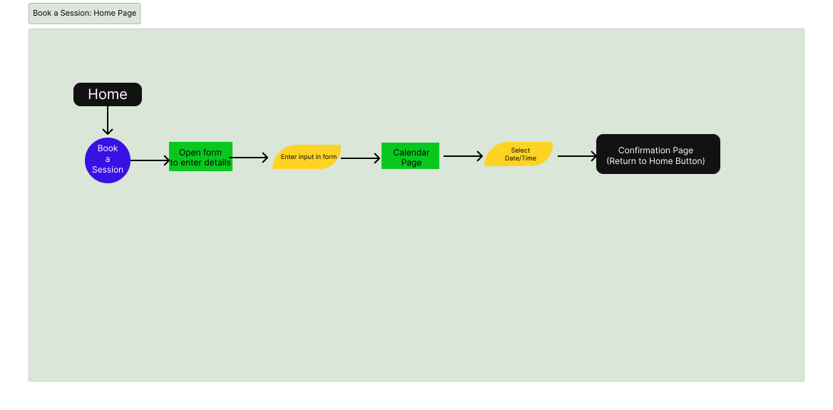
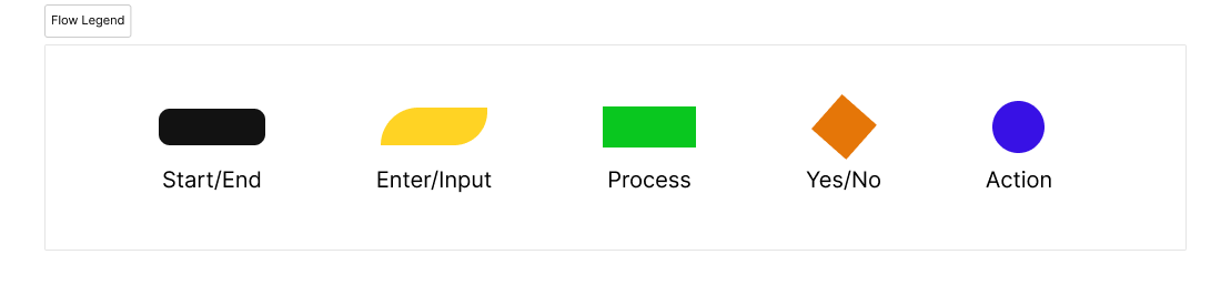
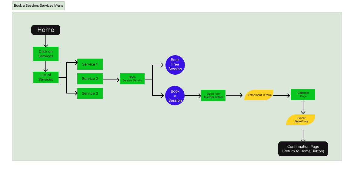
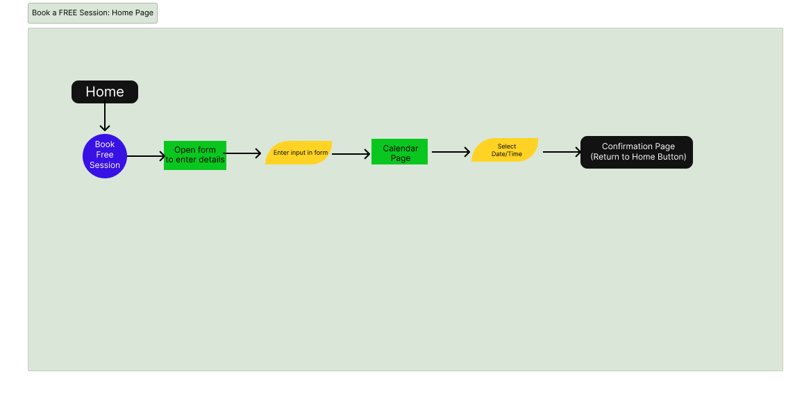
Flowcharts
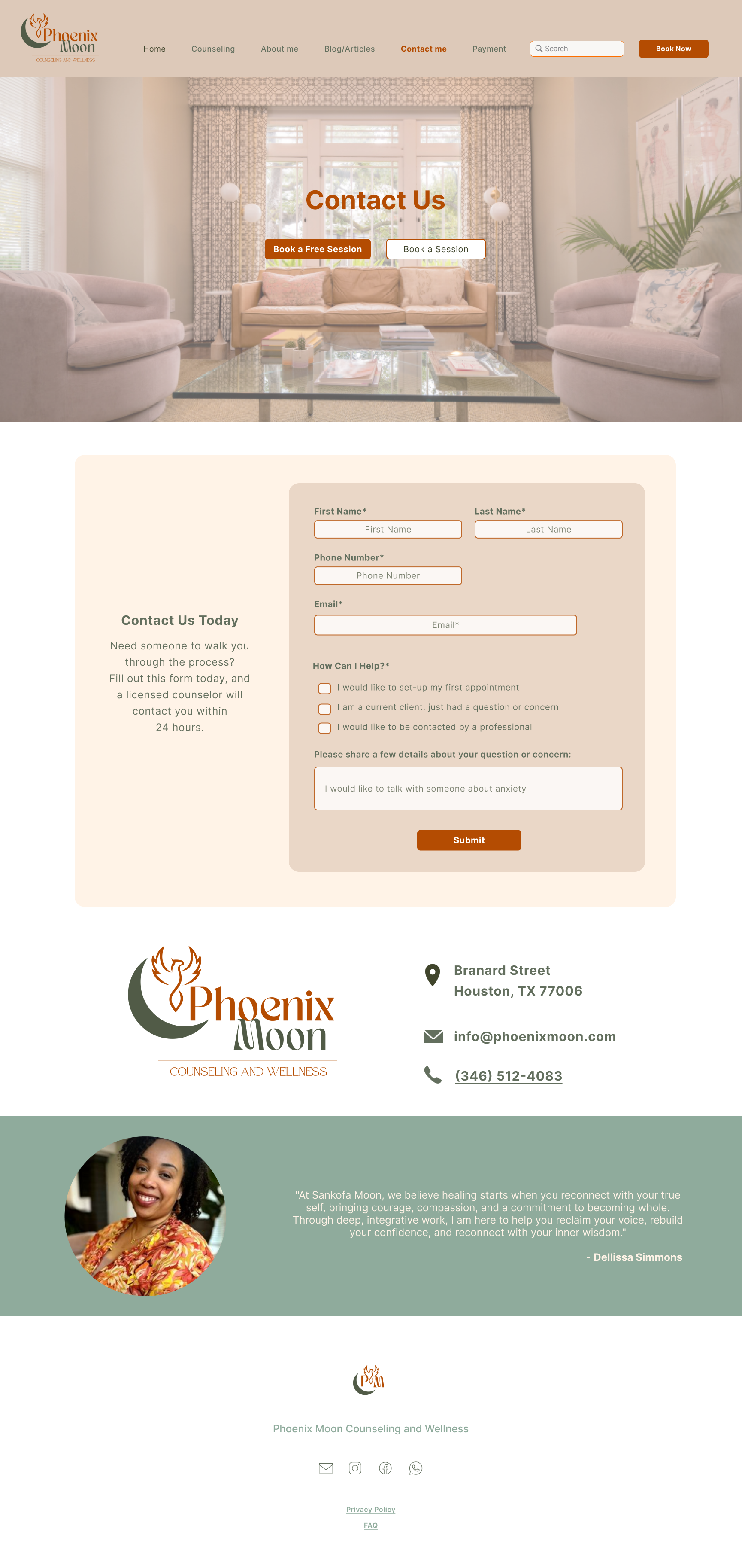
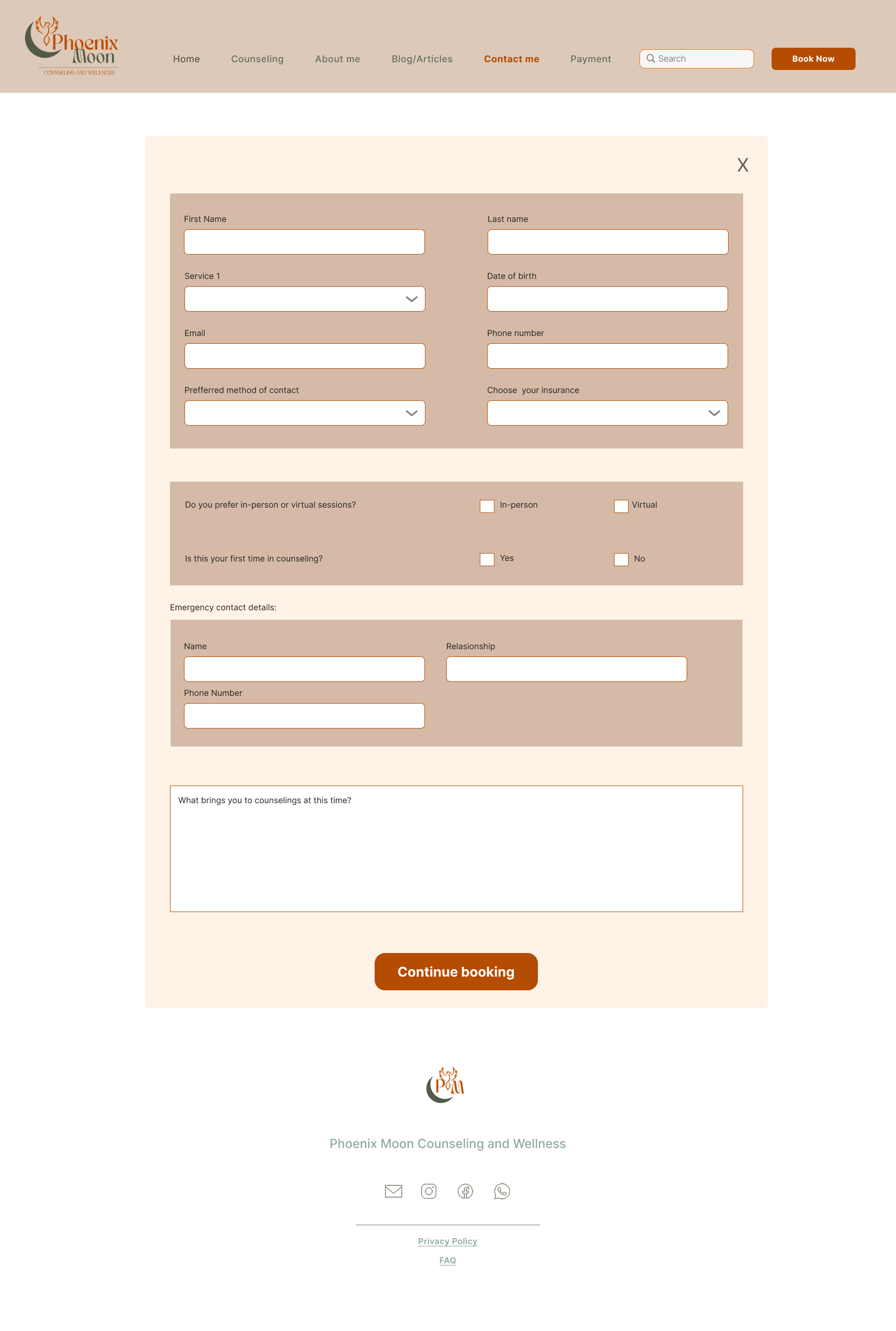
I created user flowcharts to map the booking journey, including both free and paid session options. The flows ensure users can book a session either through the main navigation menu or directly from the homepage, making the process quick, clear, and accessible.
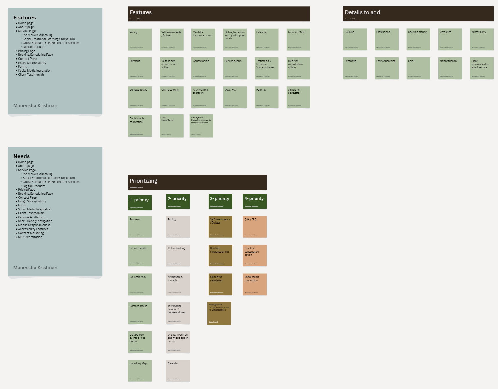
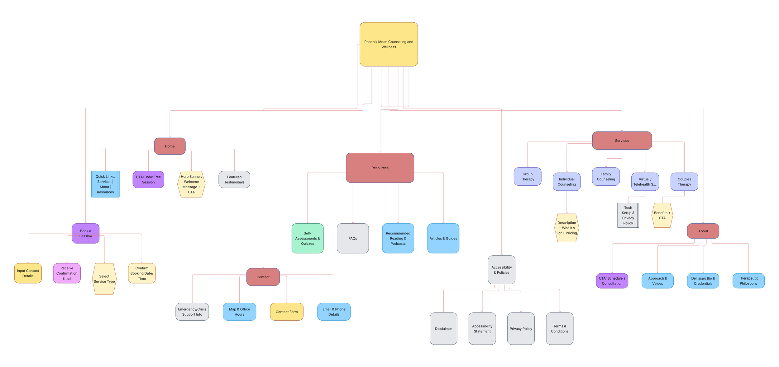
Affinity Diagram & Sitemap
I organized research insights using an affinity diagram and used them to create a clear, intuitive sitemap that makes information easy to find and supports quick booking.
Design System
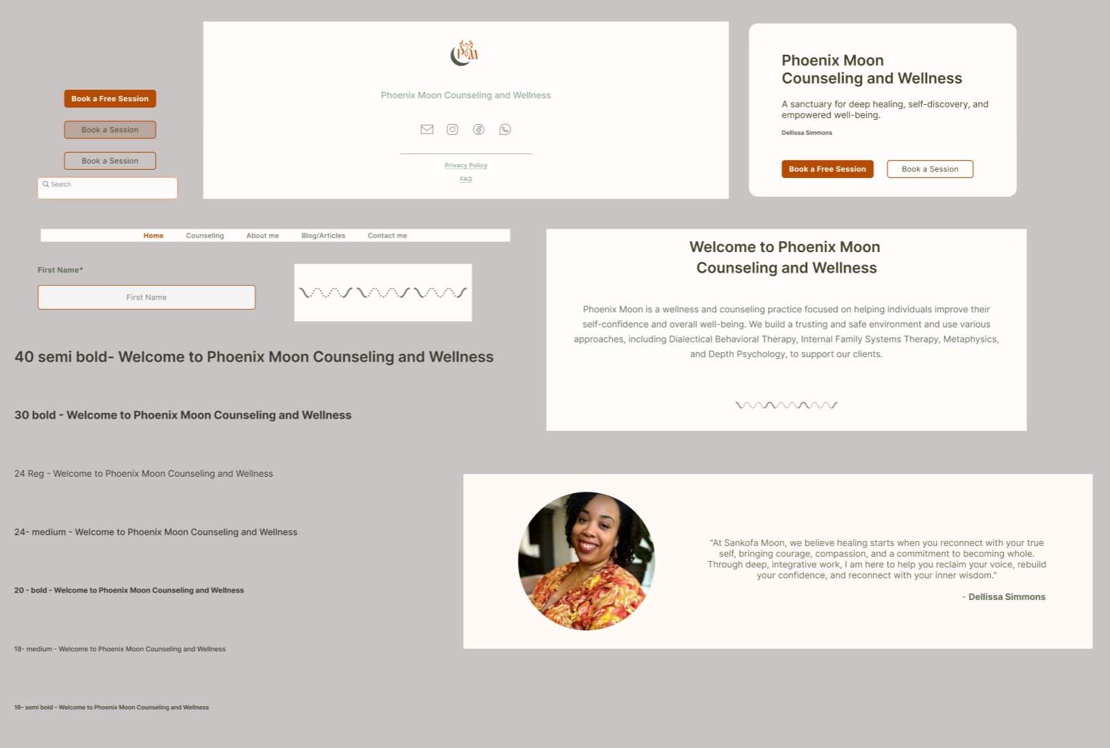
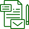
Prototype
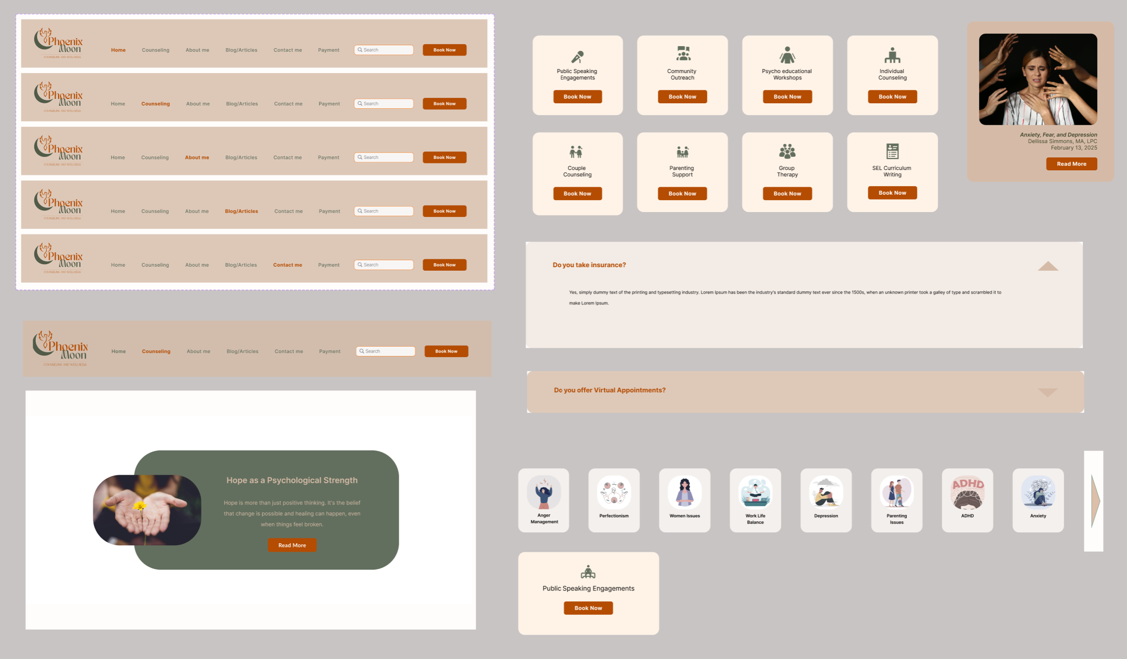
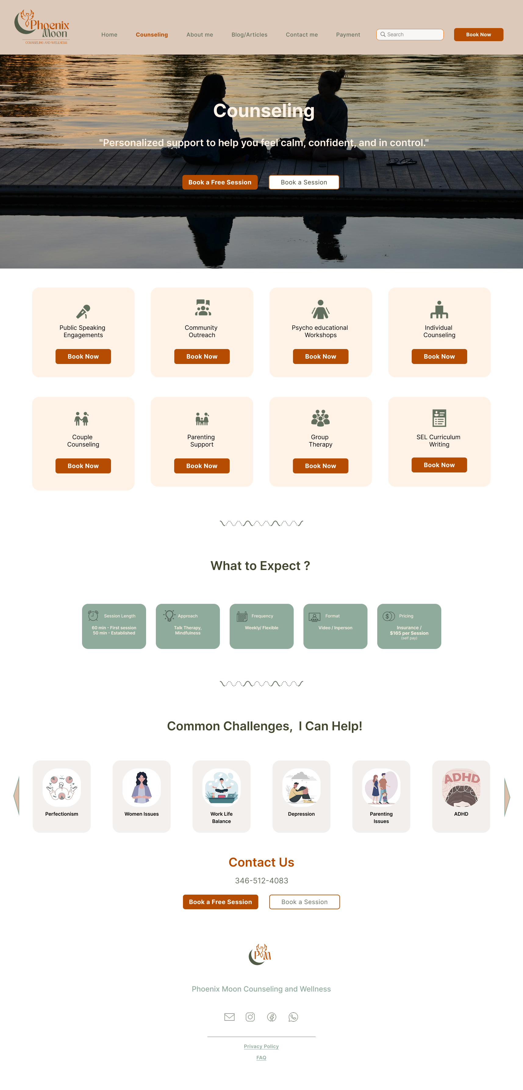
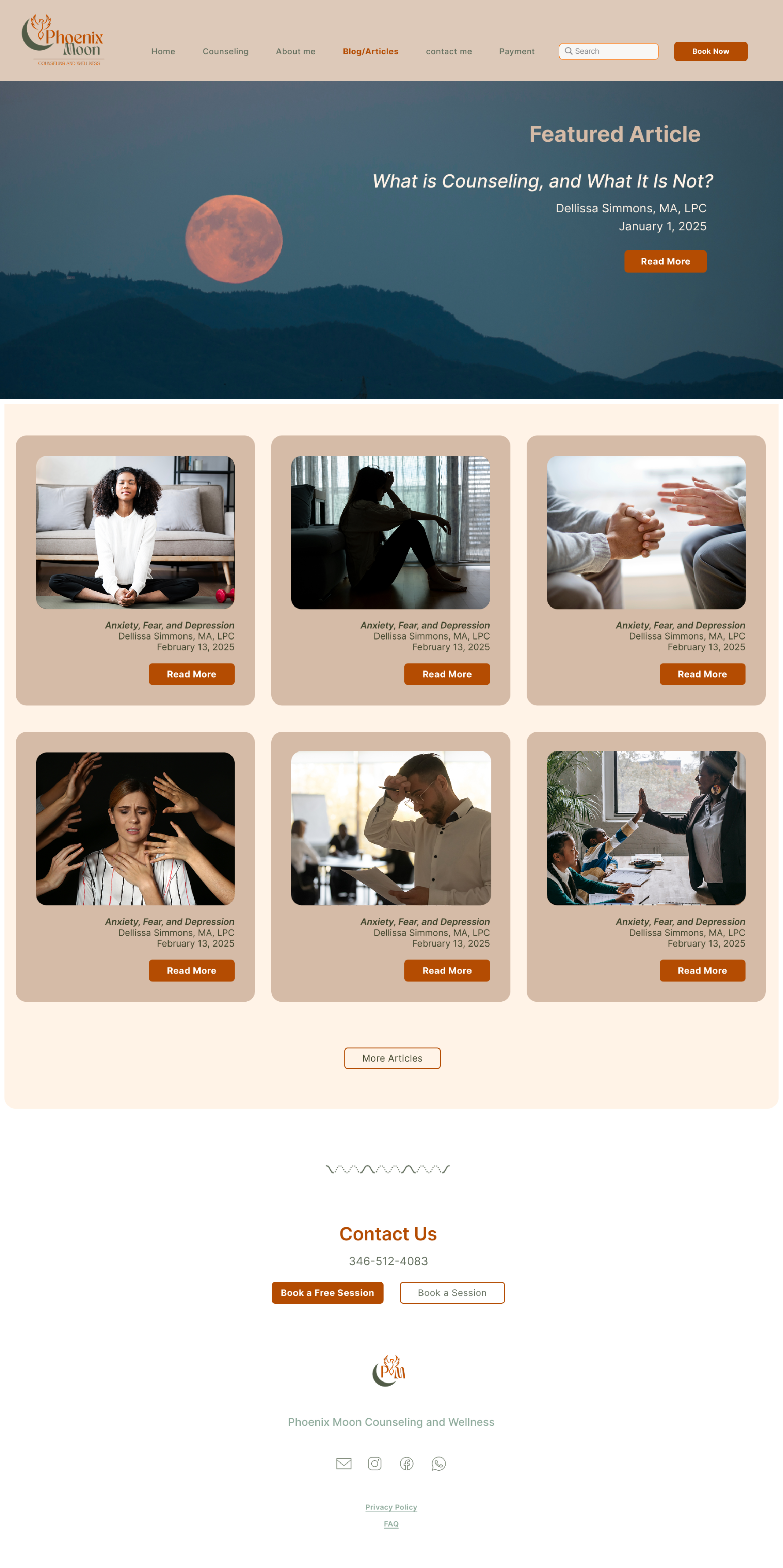
Menu Bar: A simple, organized navigation system providing quick access to key pages like Services, About, and Resources for seamless exploration.
Search Bar: Allows users to quickly find information, articles, or resources, improving usability and accessibility across the site.
Book Now Button: A recurring action prompt across pages to ensure users can easily schedule a session at any point in their journey.
Book a Free Session: An inviting CTA offering new users a risk-free way to connect, building trust and encouraging first-time engagement.
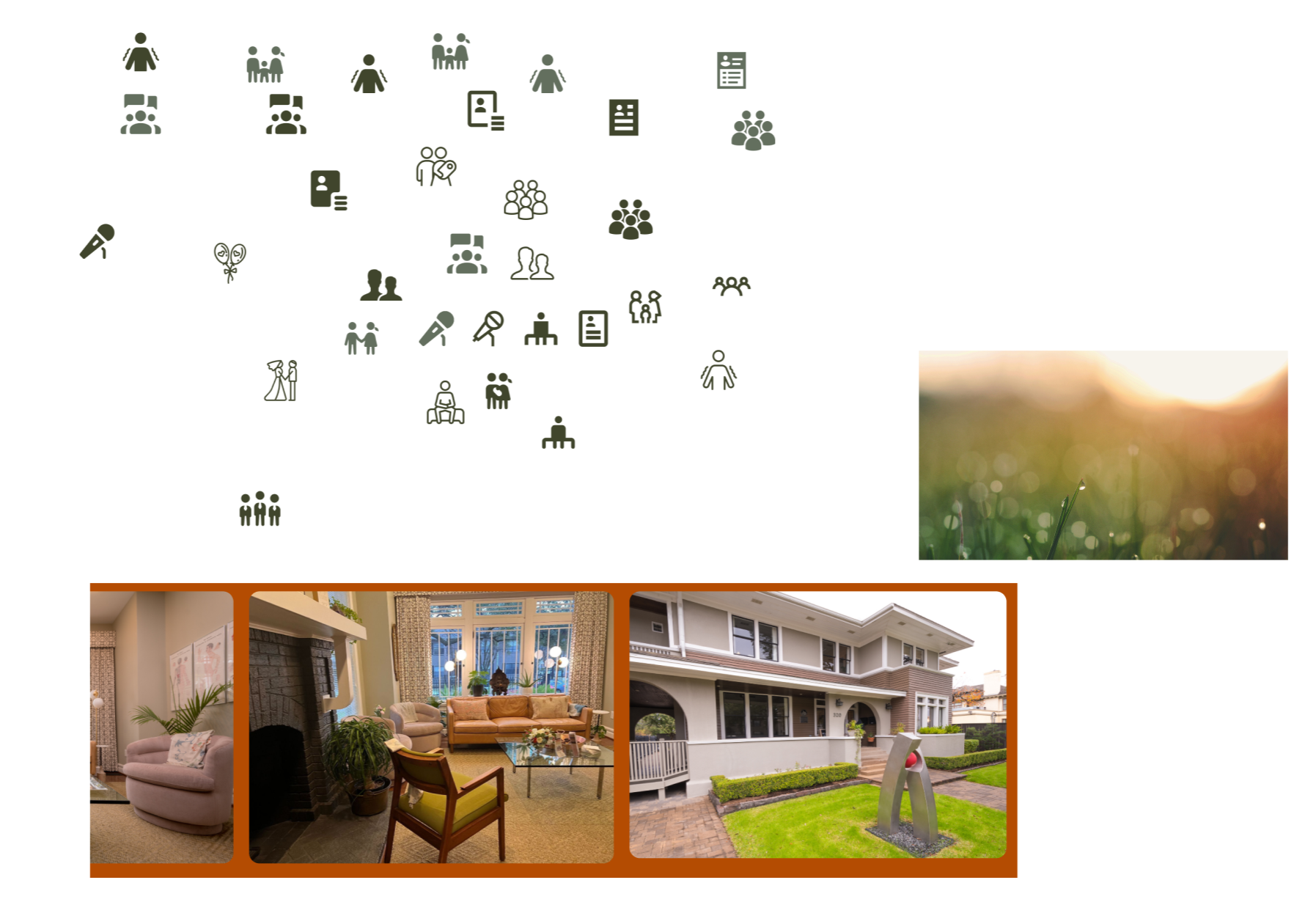
Service Icons: We used clean, minimal icons to represent each counseling service, helping users quickly recognize their options and explore areas relevant to their needs.
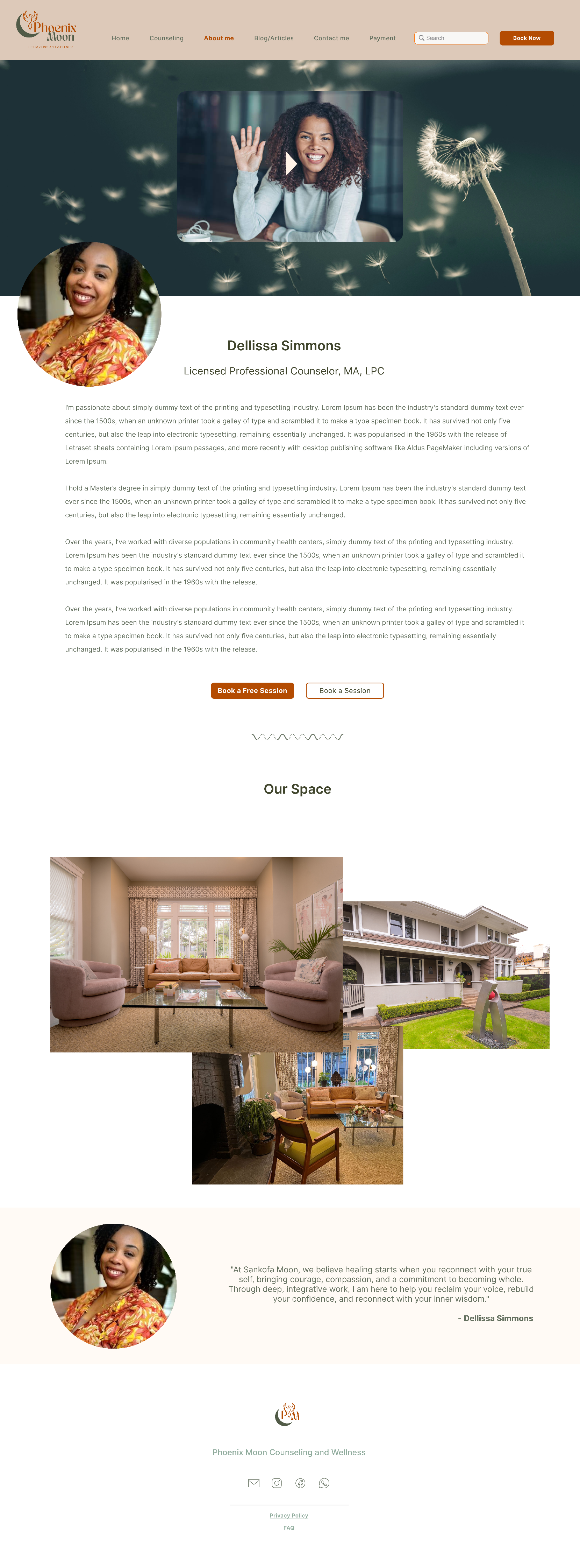
Quotes from Dellissa: Authentic, personal quotes that reflect Dellissa’s counseling philosophy and warmth, helping visitors connect emotionally and build trust.

Articles Section: A curated space featuring wellness articles and mental health resources designed to educate, inspire, and improve SEO visibility while encouraging return visits.
Focusing on Targeted Features to Address the Problem
These design choices were made to improve clarity, trust, and engagement while creating a calm, welcoming experience. Soft, neutral colors were chosen to convey comfort and emotional safety, aligning with the client's needs. Service icons simplify understanding, articles educate and support SEO, and personal quotes build trust and connection. Clear booking CTAs, along with simple navigation and search, ensure users can easily find information and schedule sessions with confidence.
Validate
I validated the design through usability checks, stakeholder feedback, and iterative refinements to ensure the website was clear, easy to navigate, and supported smooth session booking.

Validate and Feedback
Conclusion

What Next
The final design was successfully handed off to the development team with complete design documentation and assets. Due to budget-related delays on the client side, development has been temporarily paused. Once development resumes, the next steps will include building the website, conducting usability testing on the live product, and iterating based on user feedback to ensure a smooth and effective launch.