
Make it stand out
Penny Juice
Project
UI/UX Audit
Competition Analysis
UI/UX Audit:
Low-Fidelity Wireframe
Redesigned the homepage of the website https://www.pennyjuice.com/, ensuring significant improvements. Analyzed competitors, created UI/UX Audit and competitive analysis, and created low-fidelity wireframes.
I compared three websites with the Penny Juice:
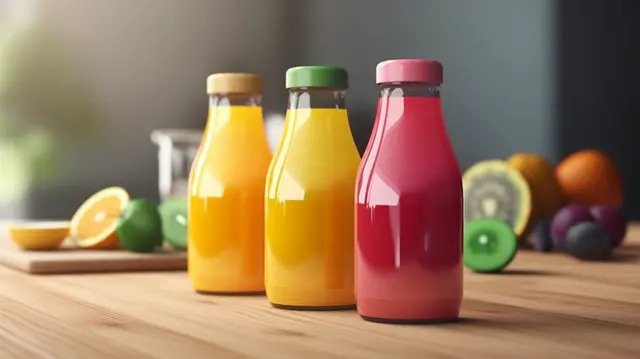
All these websites sell juice on a large scale.


Pressed.com: This homepage has a modern, minimalist look, high-quality product images, and a clean white background. It immediately presents the core offerings, which are juices and wellness shots. The site is visually streamlined, and navigation is straightforward with large, easily clickable buttons. I felt the front-page animation was too large and disturbing for the eyes. Users should have a choice to pause the image motion. I also saw a pause button on the upside of the website, and I’m not sure what that is for.
JuiceShop.com: Similar to its focus on clean design, Juice Shop also uses a white background with vibrant product images, emphasizing its organic offerings. The homepage has fewer distractions and prominently highlights its “cleanse” programs. Navigation is also straightforward, guiding users towards shop and cleanse options. I felt the search, login, and cart buttons were congested.
PureGreen.com.co: Pure Green’s site takes a slightly different approach with a more dynamic, content-rich layout. It highlights not only its juices and smoothies but also broader offerings like franchise opportunities and educational content on wellness. This approach caters to an audience interested in the brand’s broader mission. The design is welcoming, with vibrant images that give a holistic view of the brand’s offerings. The navigation bar was a bit congested as the juice shop.
https://www.puregreen.com/


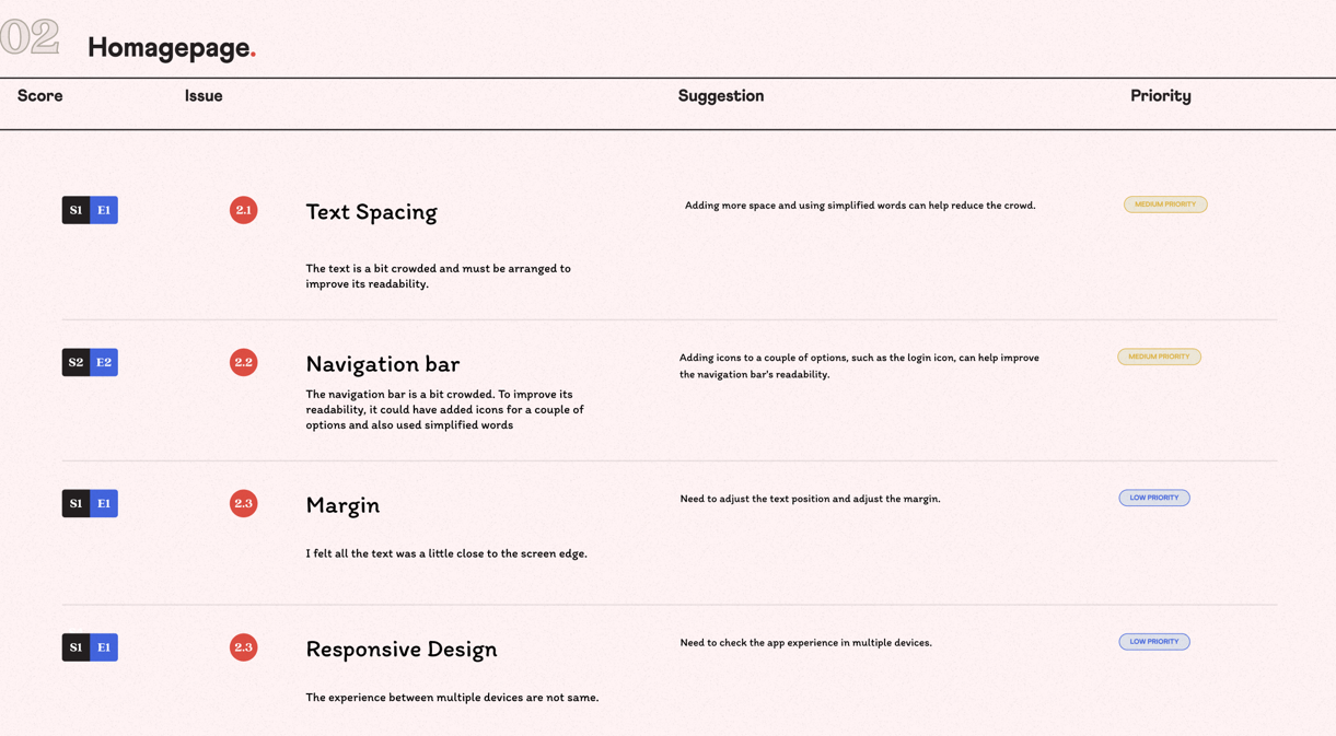
The redesign of the Penny Juice website focuses on addressing its outdated design and improving user experience to align with modern e-commerce standards. A UX audit revealed strengths, such as its clear focus on large-scale juice buyers and nutritional information, but identified critical weaknesses, including an outdated interface, poor navigation, lack of a streamlined ordering process, and limited mobile responsiveness. A competitive analysis of leading juice websites, including Pressed, Juice Shop, and Pure Green, highlighted the need for visually appealing designs, intuitive navigation, and robust e-commerce functionalities. Based on these findings, I created a low-fidelity wireframe.